Improving the Employment of People With Disabilities
The California Employment Consortium for Youth (CECY) was a set of working groups administered by the Tarjan Center at the University of California, Los Angeles (UCLA). CECY comprised organizations, state agencies, families, and self-advocates. They needed practical ways to convey their policy ideas that would improve the employment of people with intellectual and developmental disabilities (IDD).

The Backstory
CECY was a five-year grant project to develop a framework to help youth with IDD in California have a path into adulthood. They will have the resources, skills, and support to live an independent life as adults with post-educational and employment opportunities.
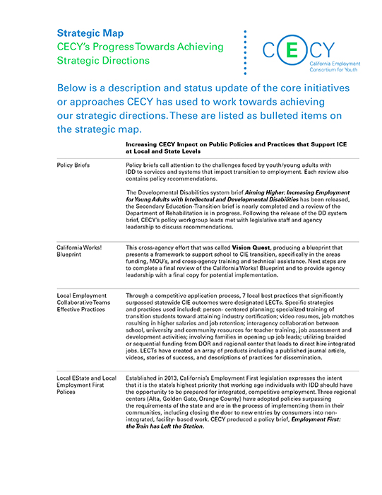
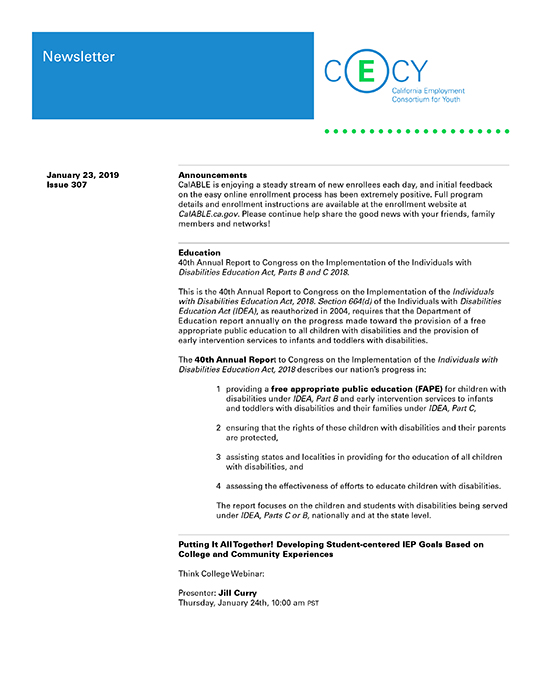
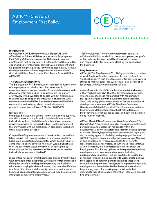
I was commissioned to design a logo and establish a basic visual system for the Consortium, consisting of colors, typeface, and brand assets. I also designed document templates and several mastheads for Word documents that CECY would use regularly.
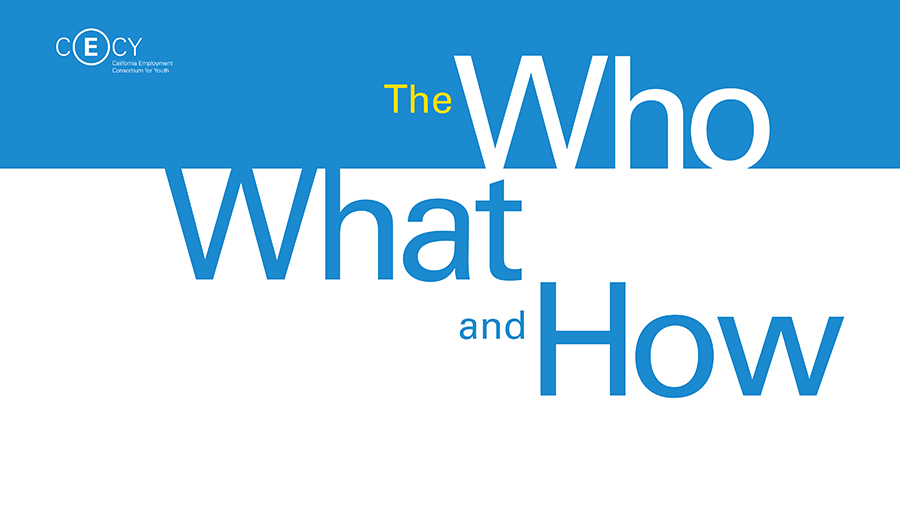
I also proposed presentation layouts, knowing that well-crafted presentation slides could help them communicate their work to shareholders, supporters, and community leaders. The presentations made information clear while also fostering a good brand impression, which could impact funding and community support.

The Approach and Challenge
The blue in the logo is associated with the branding for UCLA academic schools, colleges, and programs. The green in the logo provides an earth tone that reflects happiness, energy, and growth. It is also a color that works with the warm and friendly portrait photography used in the presentation designs.
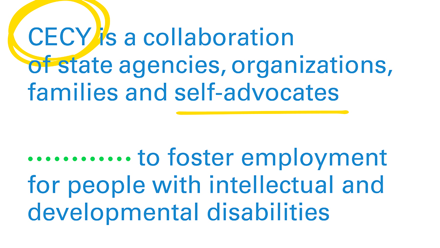
CECY’s logo has an E within a circle to symbolize how people with IDD need to be included within the inner circle of employment. The E circle element can be used by itself as a pattern or as a graphic within a composition. The E inside the circle also influenced the use of various circular elements in the presentation designs. Circular elements were made into lines for eye movement and visual textures. I also used hand-drawn circles that highlighted various pieces of text and people in photographs.
