Bringing Awareness To Disability Injustice
The Awareness Campaign gave attention to moments when people with disabilities experience awkward encounters that resulted in overt and passive aggression, ableism, and discrimination. The campaign called these encounters Whaaat?! Moments to teach disability etiquette.
The Backstory
The Awareness Campaign is a personal design project. The idea for the campaign was born after reading startling students’ comments about my disabilities. At that time, I was living and teaching in Richmond, Virginia, seeking opportunities for my future. Reading the comments made me reflect on the many moments throughout my life when I experienced various kinds of aggression, ableism, and discrimination.
I quickly developed a desire to use my design and teaching expertise to bring attention to moments that were common for many people with disabilities. It was at that time that I decided to devote my design career to disability advocacy and accessibility. I joined the University of Minnesota Duluth (UMD) faculty soon after making that decision. The Awareness Campaign was a perfect way to kickstart my research and creative activities as a UMD faculty member.
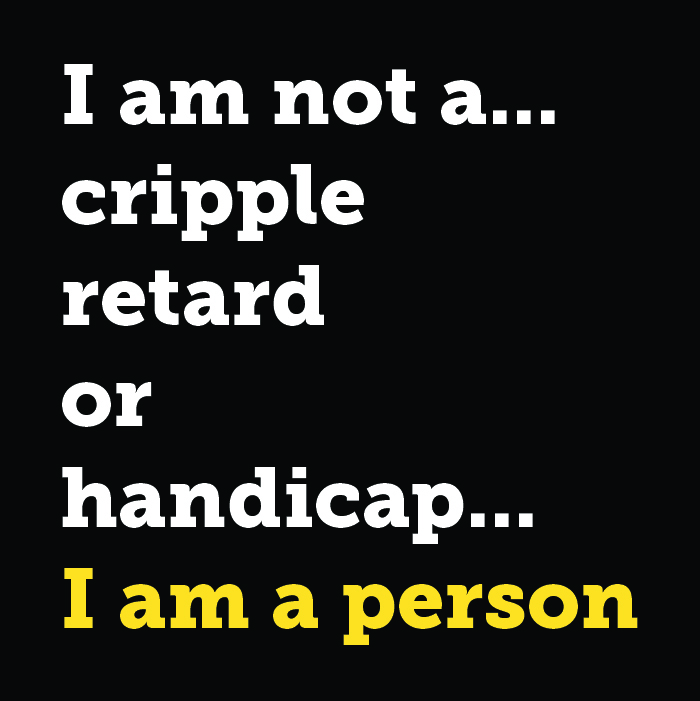
Fighting for Disability Injustice
The Awareness Campaign was personally empowering because it allowed me to accept my disabilities fully. I was now able to channel my frustrations about disability injustice by working on the campaign daily.
The Approach and Challenge
Communication strategists Deanna Geneva Lorianni and Meghan Codd Walker of Zuula worked with me during the project’s development phase to produce the campaign’s brand strategy. It was during that time that we developed the concept of Whaaat?! Moments. We concluded that it was an approachable and engaging way of explaining to children and adults the different kinds of aggression, ableism, and discrimination that people with disabilities experience throughout their lives.
The Campaign’s Mission
The use of the three A’s in Whaaat?! stems from the three words that define the campaign’s mission:
Bring Awareness, take Action, and help Advance the conversations about ableism and disability injustices.
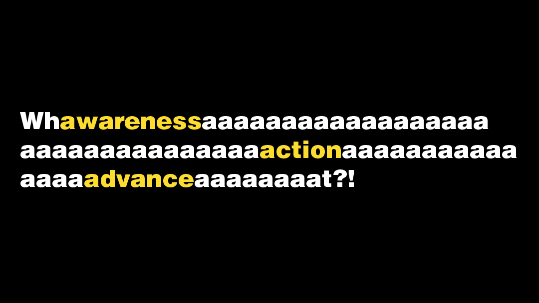
Whaaat?! Moments Are Real
The idea for Whaaat?! Moments originated when I described the many times I was baffled by the encounters I experienced.
Local Duluth actors and I reenacted some of those encounters for a video series for The Awareness Campaign.
.
Describing Whaaat?! Moments
People were asked to describe their Whaaat?! Moments during a workshop organized by The Awareness Campaign. Some people developed various drawings to illustrate their experiences. Those drawings influenced how the campaign illustrated characters to speak about various issues, such as using the R-word.
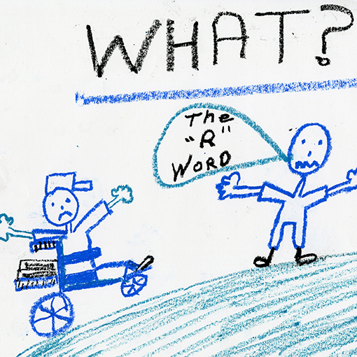
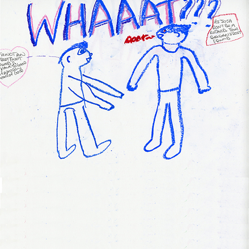
Keeping it Simple
To make the discussion of Whaaat?! Moments effective, its definition had to be simple. It had to allow The Awareness Campaign’s illustrations and other brand elements to tell the stories of how and why aggression, ableism, and discrimination take place.
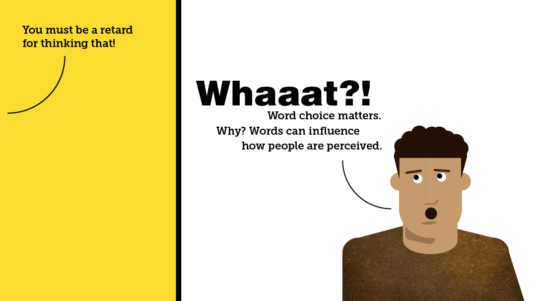
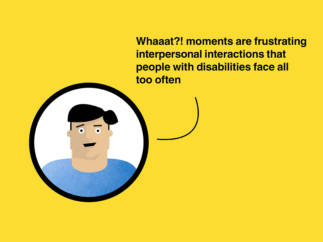
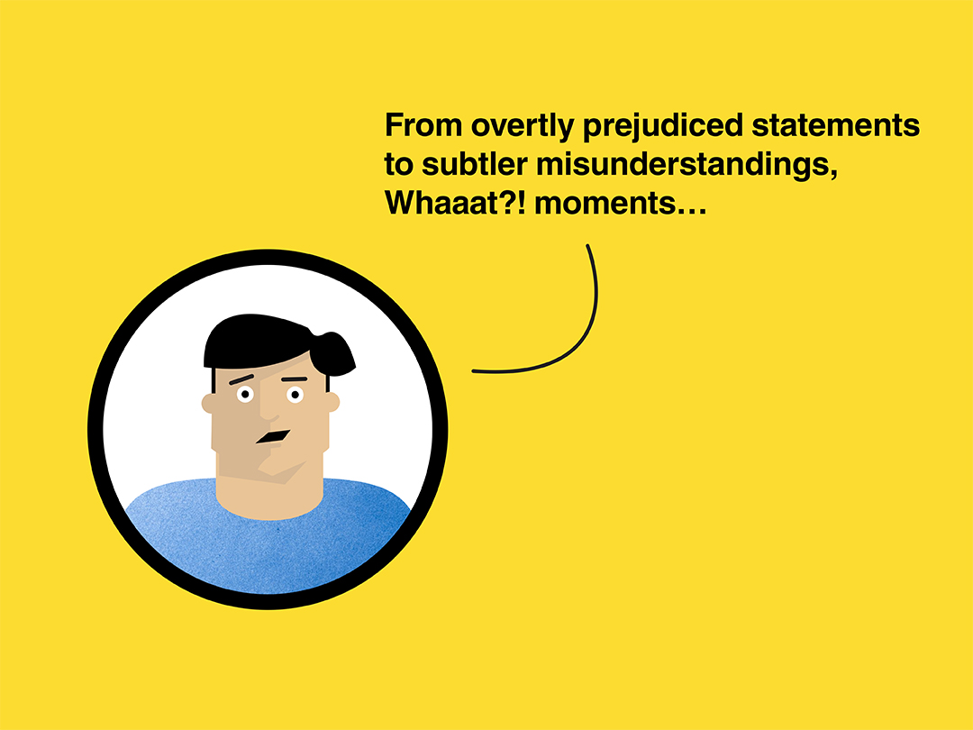
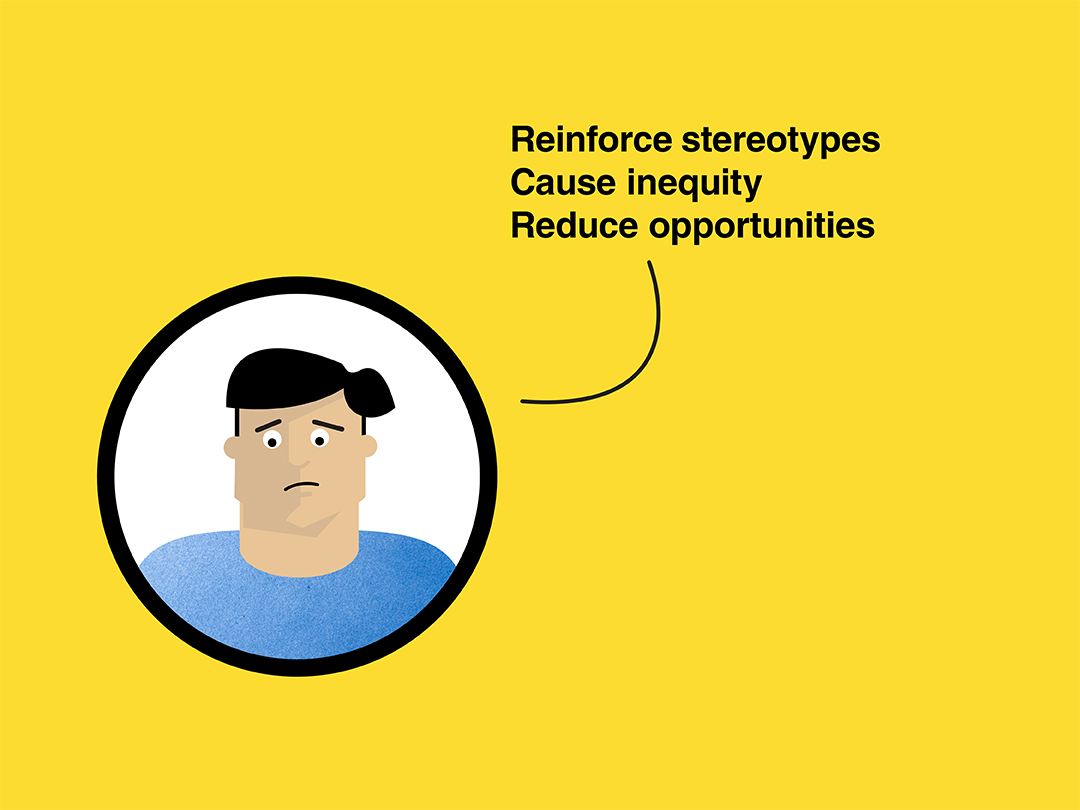
The visual system that was designed for The Awareness Campaign was vital to the success of making a broad range of content. The system consists of a logo, colors, textures, typography and illustrations that brought the campaign’s message to life.
The Logo Design
The concept of the logo originated from the ideas of protest posters with their stencil typography, serving as a reminder to keep fighting for disability rights. Attention to detail was given to the letter A. Its counter served as the baseline and x-height for formatting the campaign’s name, which sits on the right side of the circle.
Colors and Textures
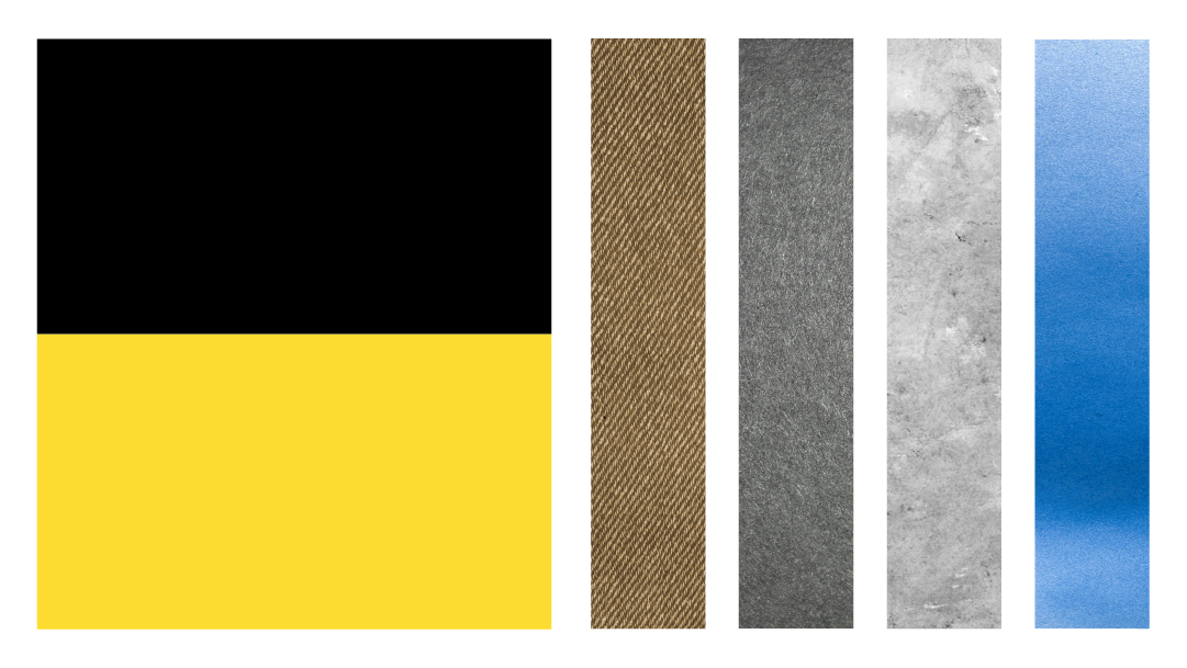
The color contrast between yellow and black helped make the campaign’s visual elements and typography legible for various people. In addition to accessibility, the color scheme made the campaign’s content bold and demanding of attention.
I used a library of textures for the design elements and illustrations; they were complementary to the flat yellow and black planes of color, particularly the cartoon-style characters.
Characters’ Mass Appeal
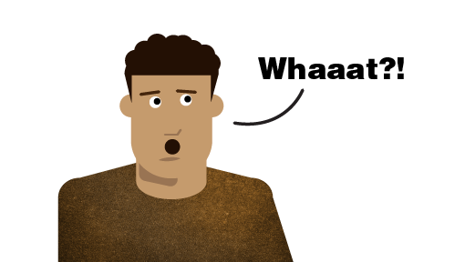
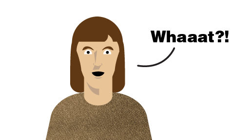
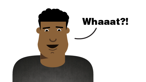
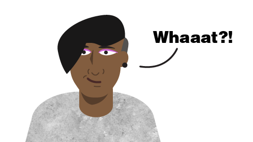
I designed a library of premade characters was an important part of The Awareness Campaign’s visual identity system. The characters showcased a diversity in gender, race, and abilities. They were copied and pasted into illustration and design files with other brand assets, which enabled content for the campaign to be made in a few hours if not minutes. The characters met the objectives to make content approachable and engaging by having a mass appeal with their simple vector cartoon style.
The Selection of the Typefaces
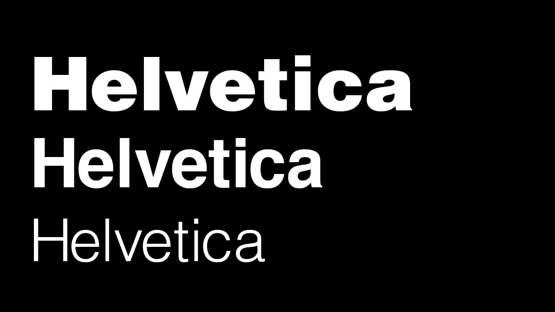
I used Helvetica and Museo Slab typefaces and their different weights as a part of the campaign’s visual system. The different weights offered the most flexibility for designing content. For example, designing an infographic versus a social media post.
The Use of Helvetica
The Helvetica typeface was a part of the visual system because its simple letterforms and font weights complemented the imagery and other elements.
The Accessibility of Helvetica
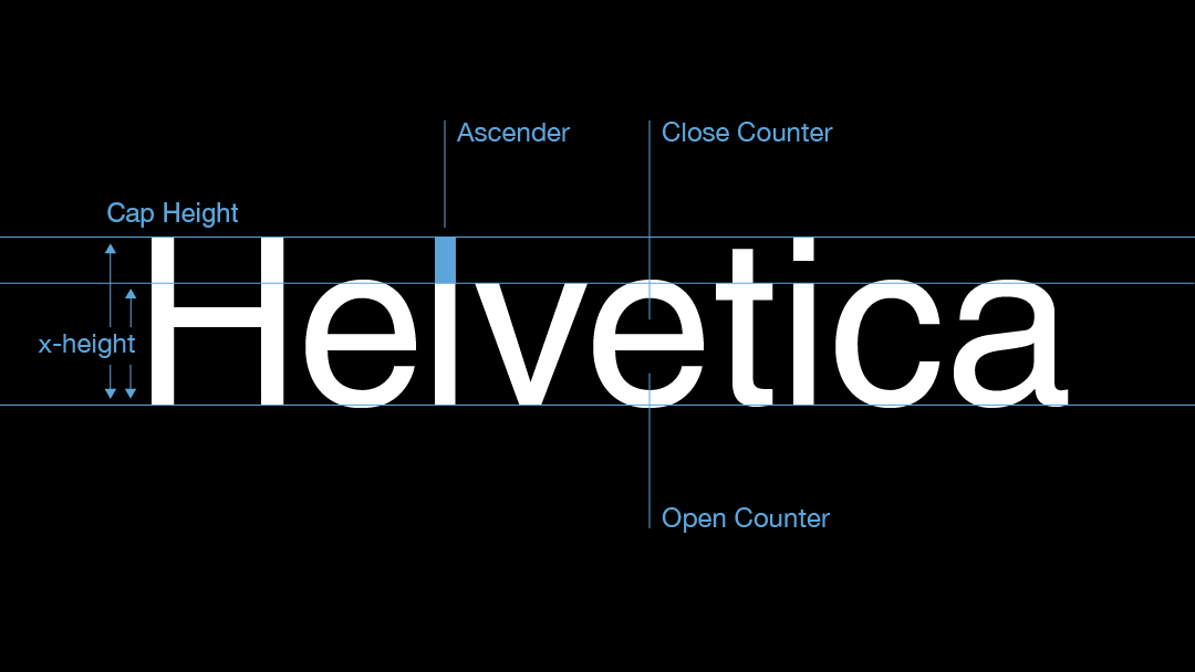
Making content accessible was an important factor when I chose Helvetica to be a part of The Awareness Campaign’s visual system.
Helvetica also made written content legible with its high x-height and big counters.
The Use of Museo Slab
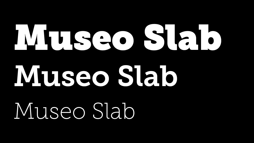
The typeface Museo Slab, designed by Jos Buivenga, was a perfect choice to be a part of the visual system, because it has presence and is very identifiable. Unlike Helvetica, it demands attention, thereby making it effective for speaking out on the disability injustices.
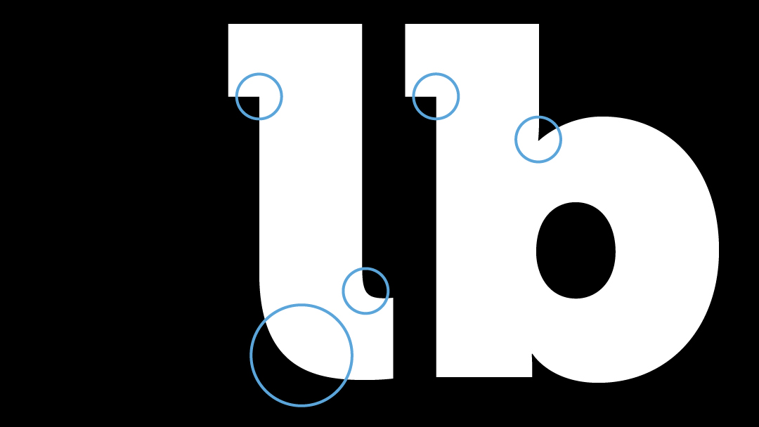
Museo Slab’s Anatomy
Slab Serif typefaces often have sharp vertical and horizontal lines. However, I selected Museo Slab typeface because it has a good contrast between the sharp head serifs and the rounded terminals. The sharp head serifs gives the typeface a demanding presence while the rounded terminals makes it less rigid.
The Use of Facebook
Facebook was one of the primary platforms that The Awareness Campaign used to bring awareness to Whaaat?! Moments and other disability issues.This effort resulted in a steady flow of views and engagements with over 15,000 visitors per week.
I made each post as if I was designing mini-posters that could grab attention quickly. This approach led to several design experiments that studied how to produce social media content that got the most views and likes.
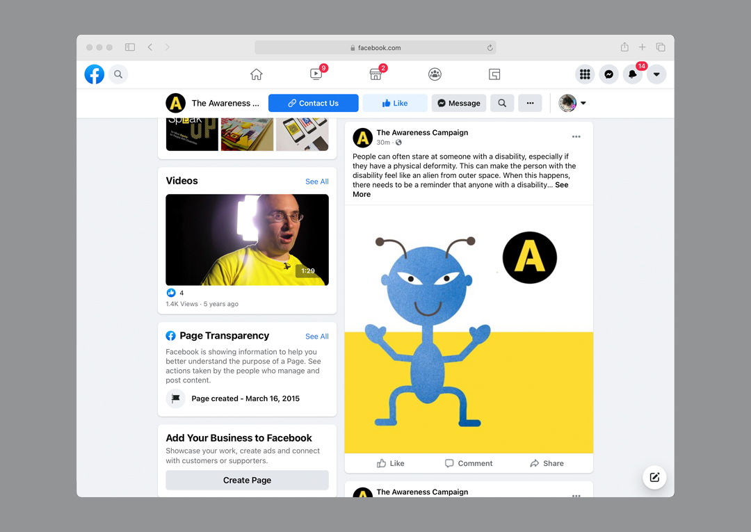
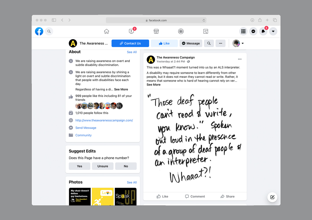
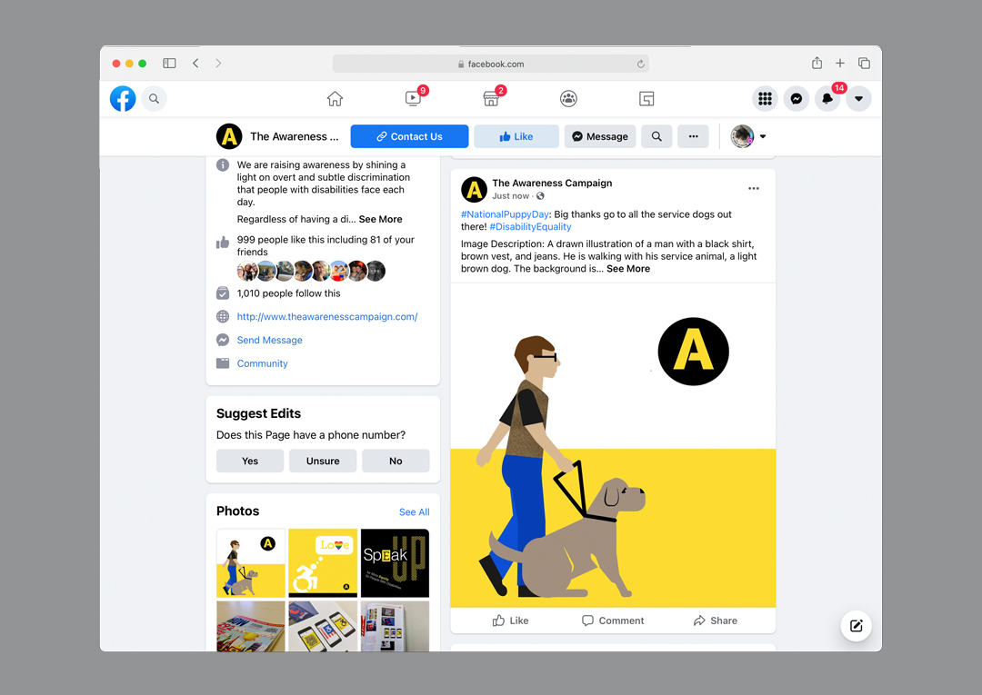
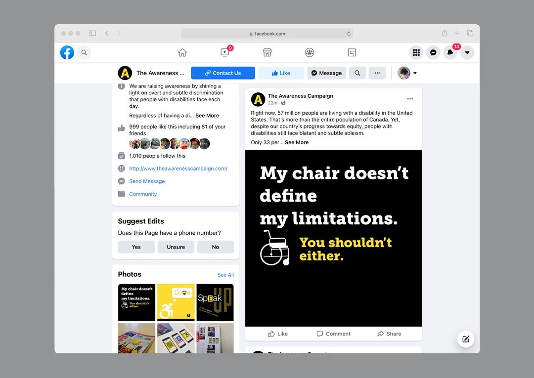
The Awareness Campaign was a four-year project that has impacted my current accessibility projects. Its content has been awarded, exhibited, and published internationally 18 times by organizations such as Graphis, Creative Quarterly, GDUSA, and How Magazine.
The Use of Instagram
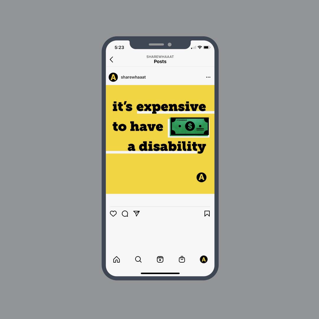
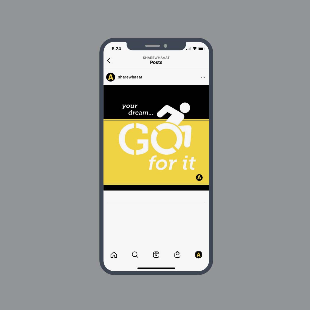
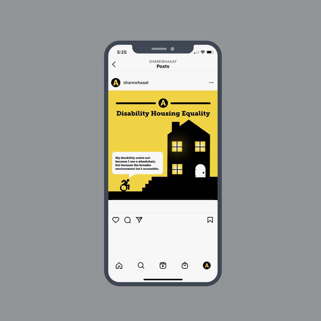
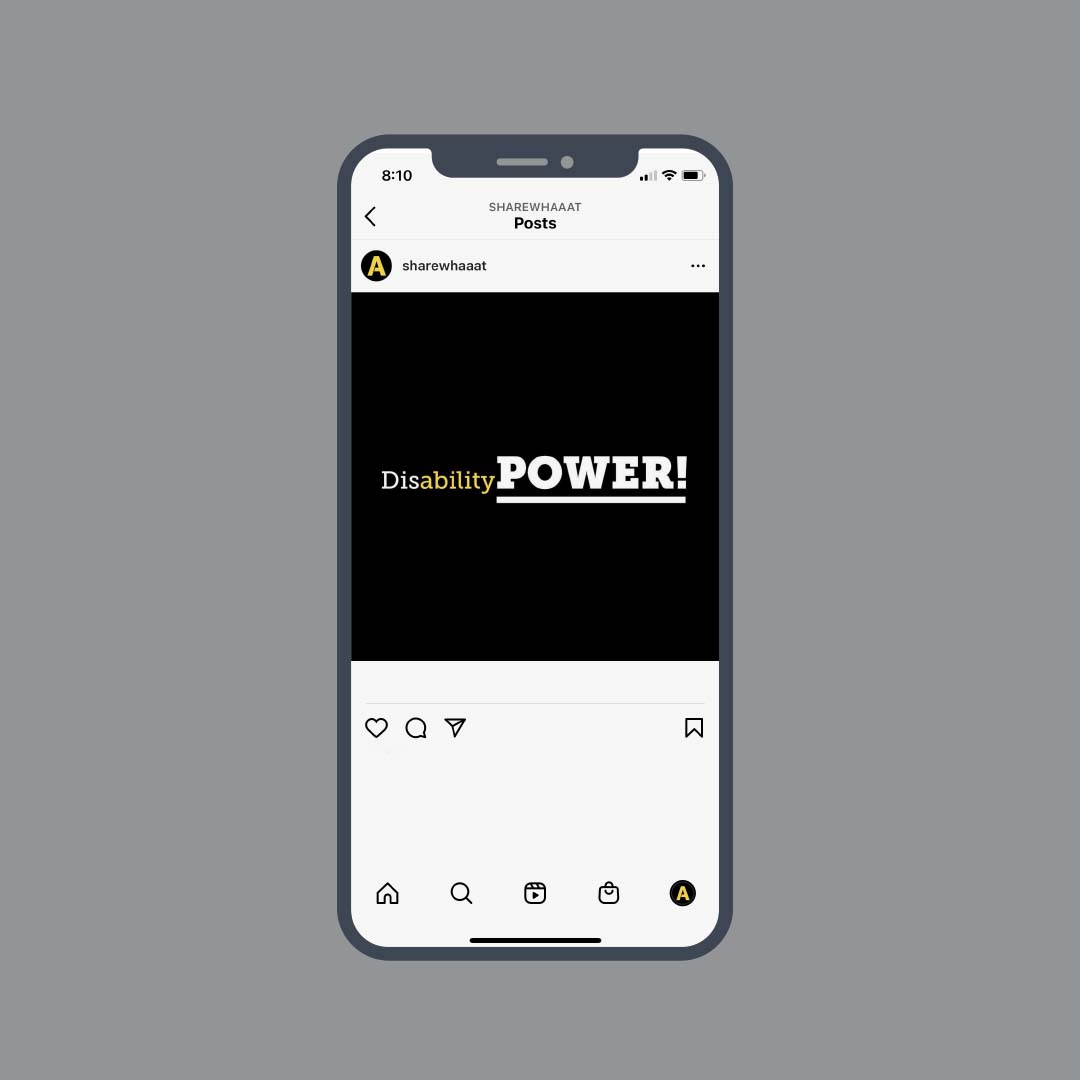
Instagram content provided a progressive view regarding disability injustices in relation to other social injustices. Other posts were about being empowered as a member of the disability community. The system of typefaces and imagery provided a visual language that made the posts identifiable as content made by The Awareness Campaign. As with the Facebook posts, I approached the design of Instagram content as if I was creating printed posters that easily could grab people’s attention.
You can explore more Instagram posts by visiting the Instagram case study.
