Having a Far-Reaching Impact
At the start of The Awareness Campaign, I aimed to have a far-reaching impact by telling the struggles and ableism that people with disabilities experience. To this goal, I needed to make content for a platform that would fuel the work of disability advocates while also informing the general public about disability injustice.
The Backstory
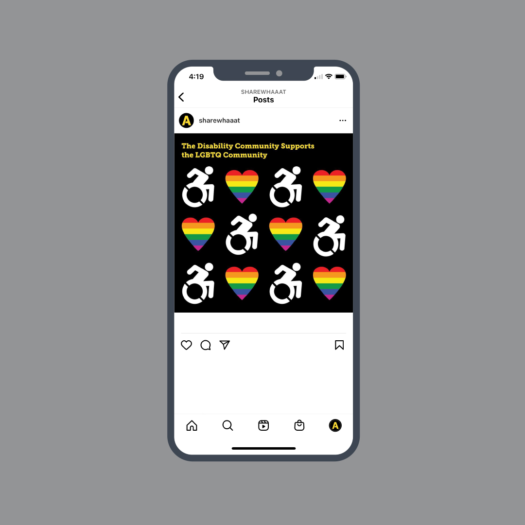
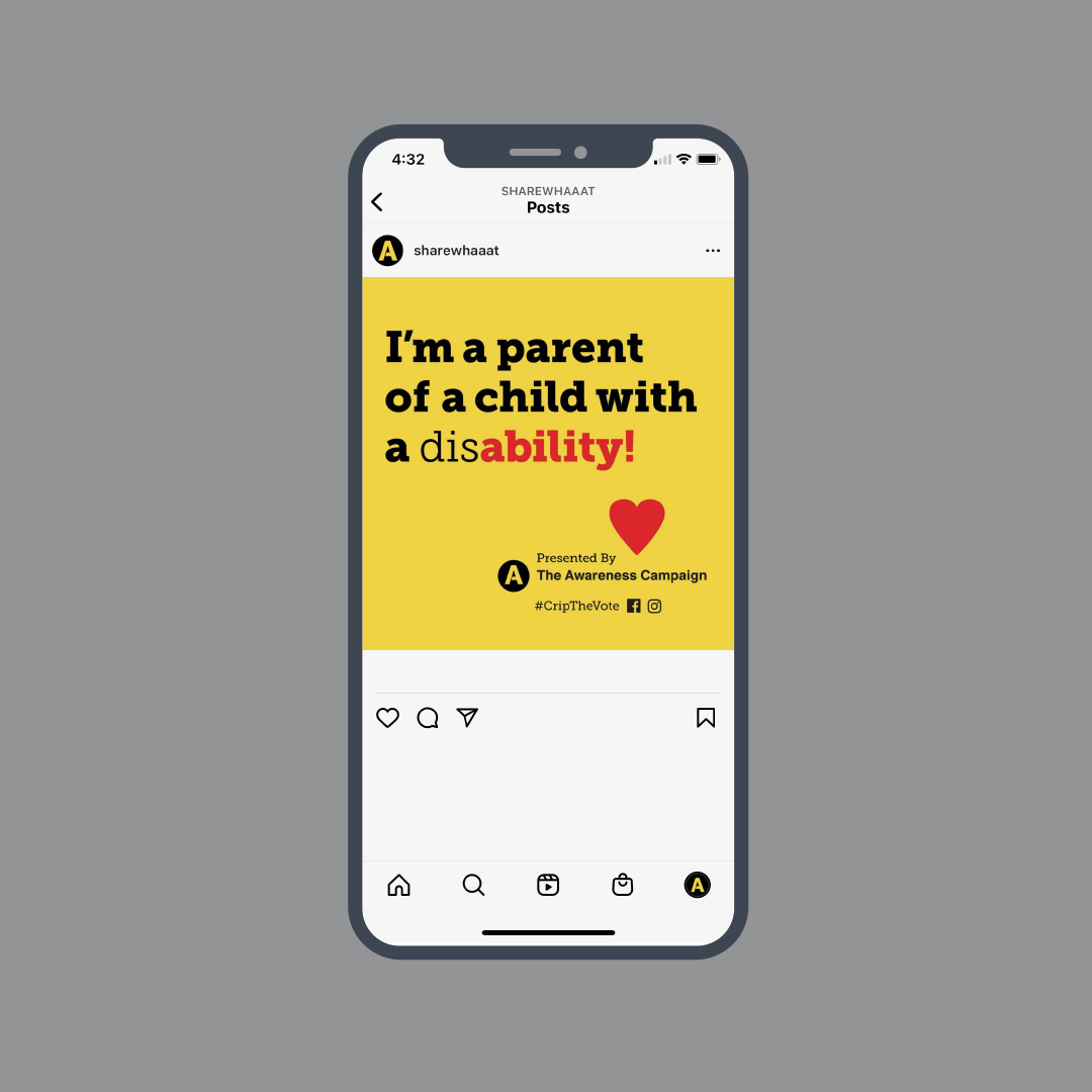
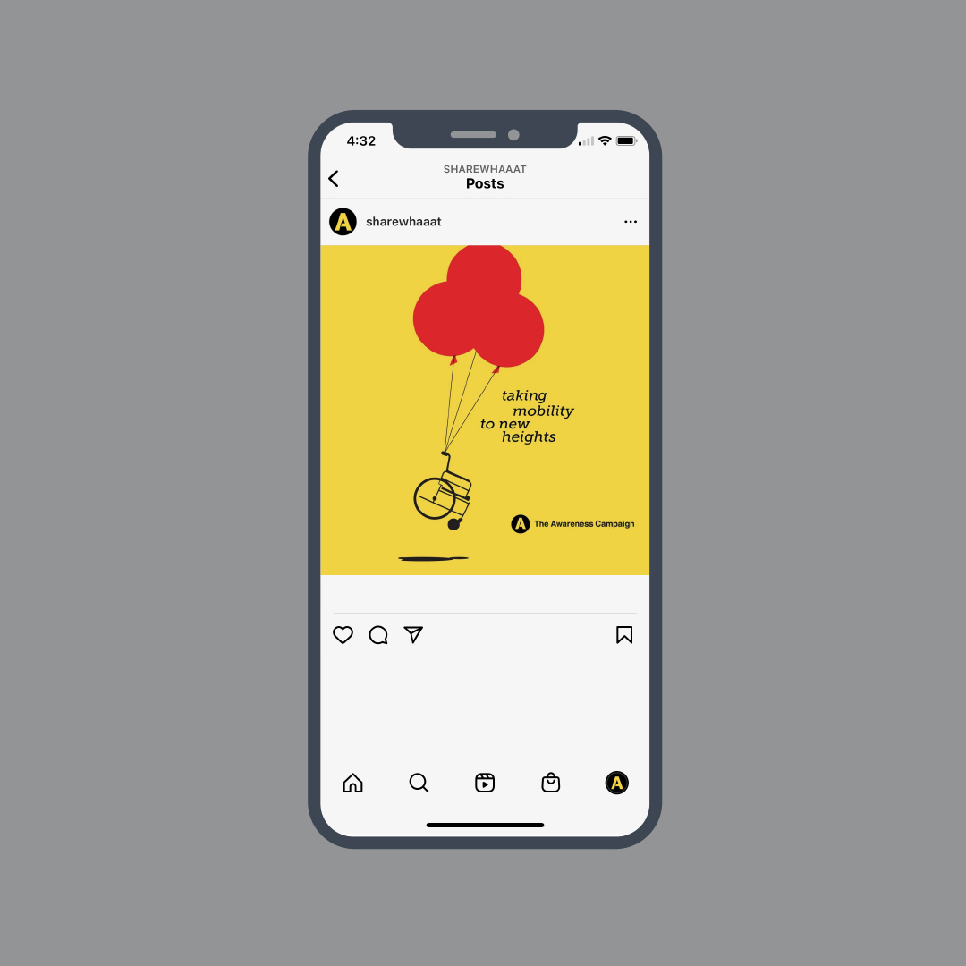
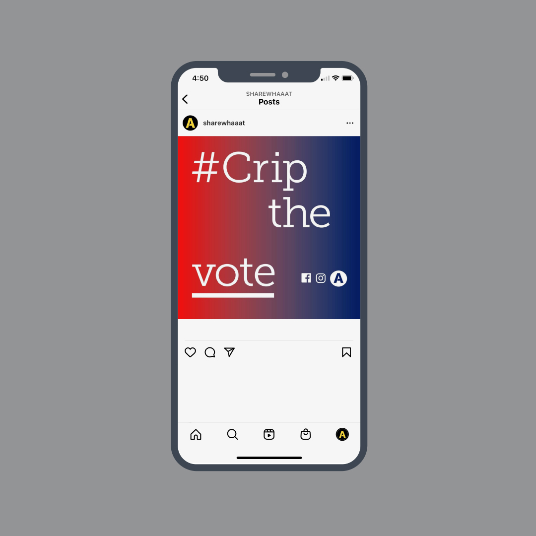
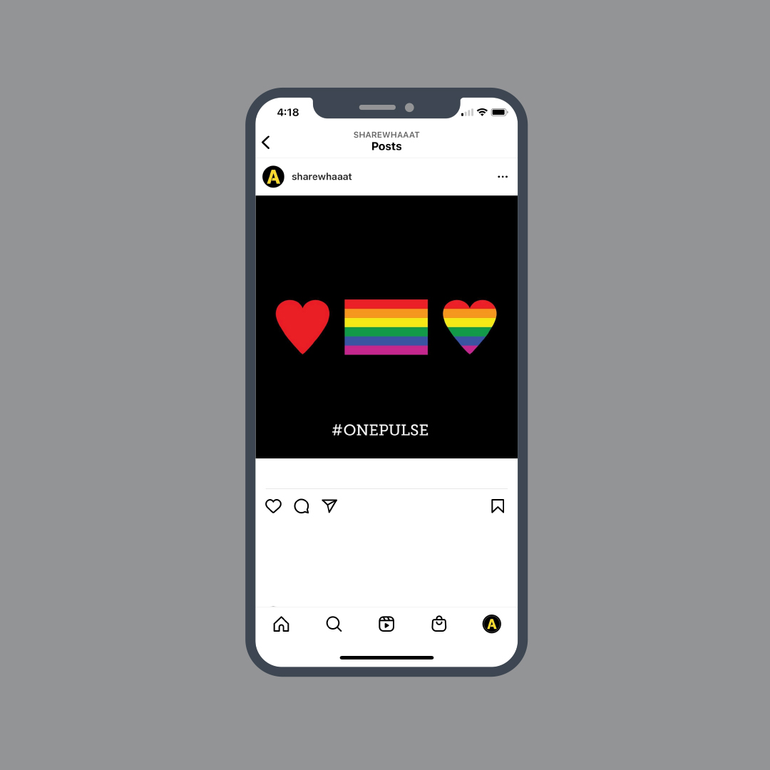
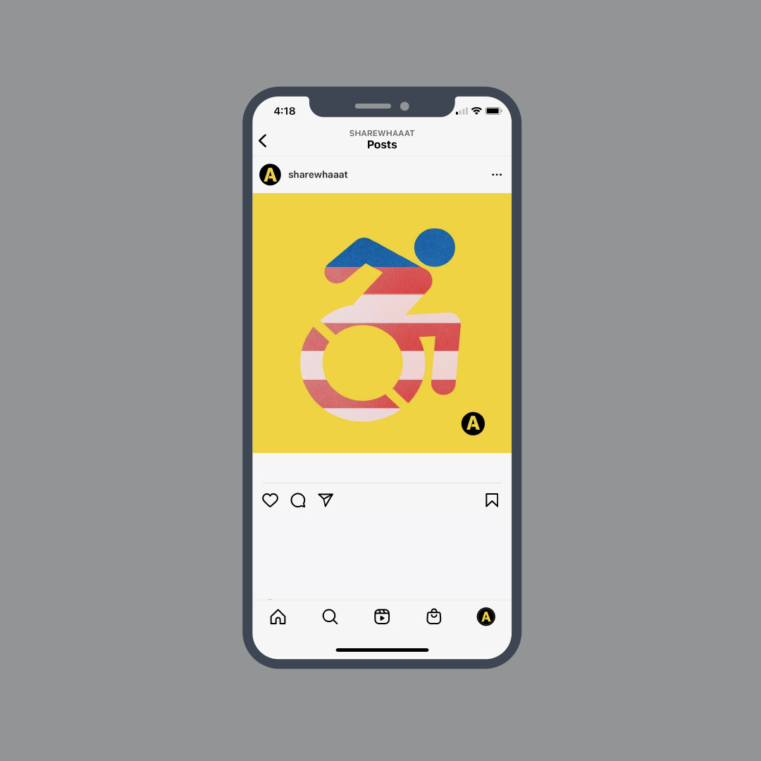
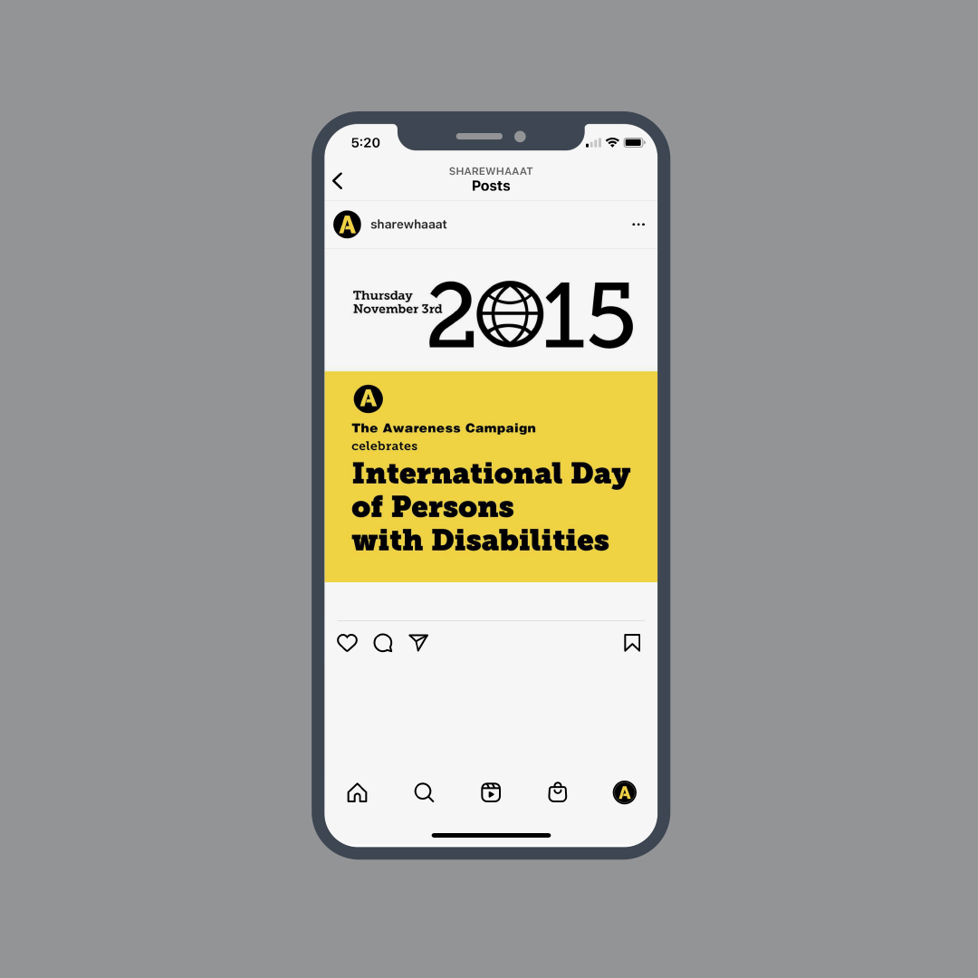
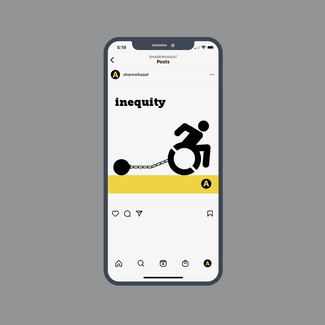
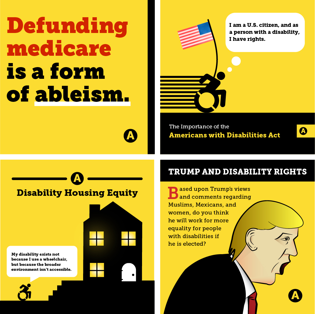
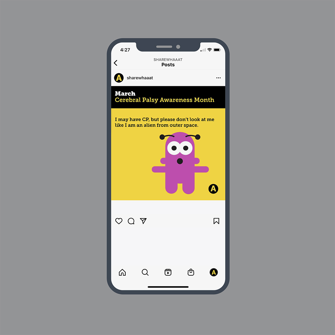
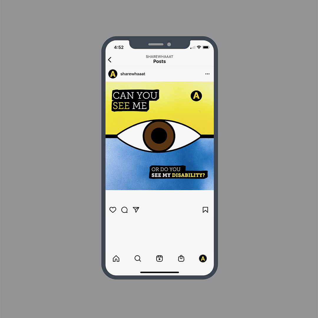
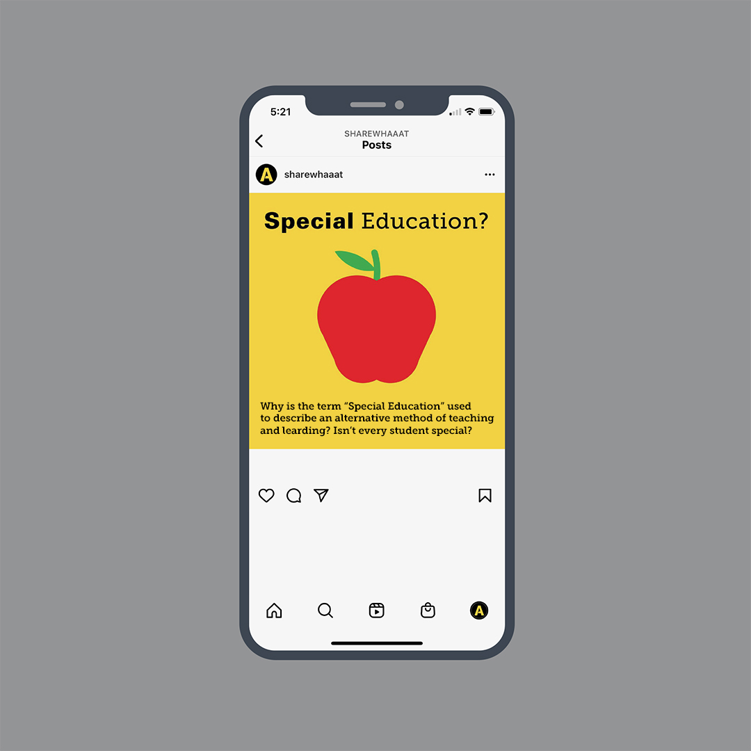
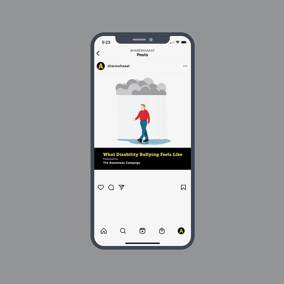
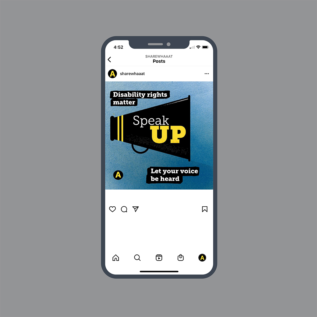
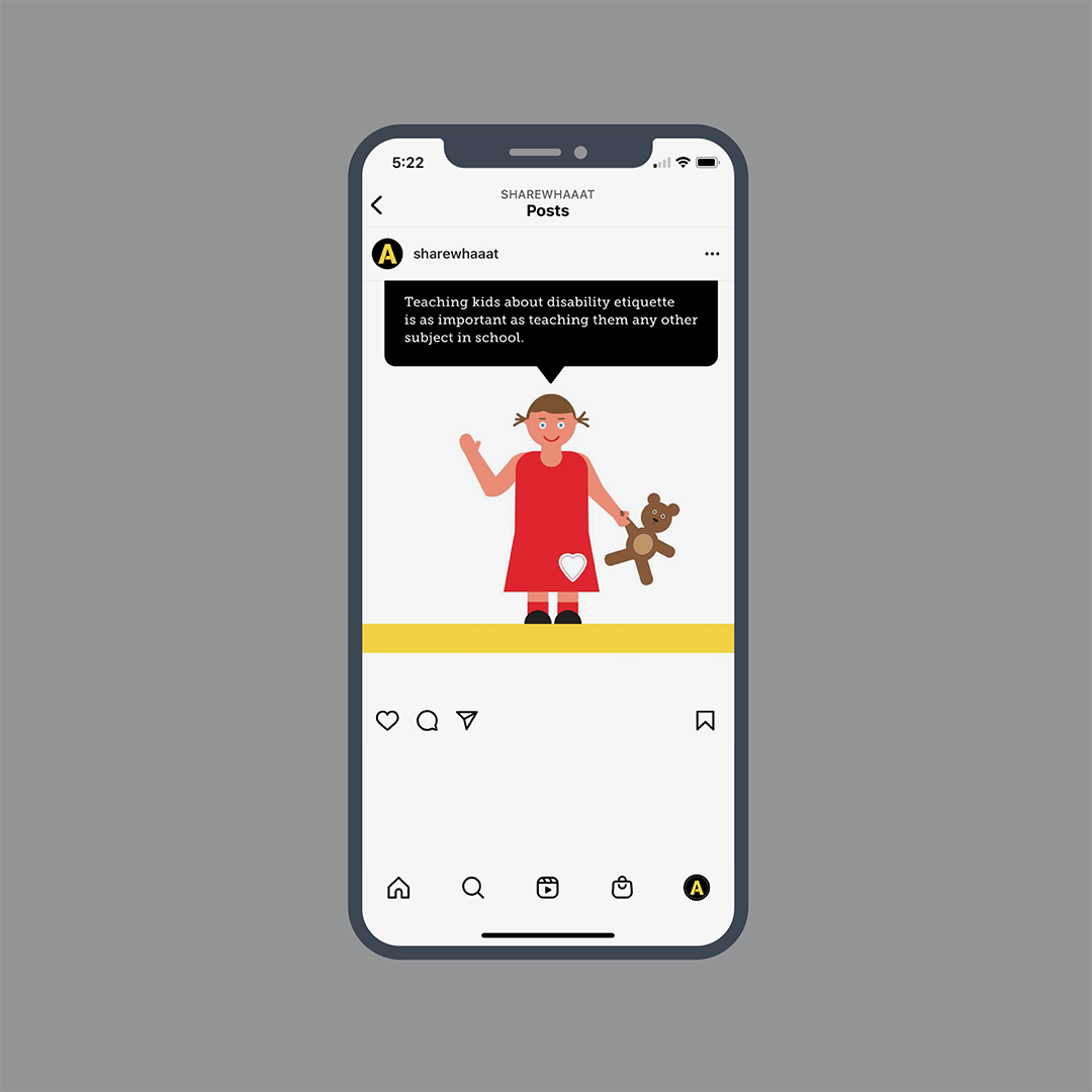
The Awareness Campaign chose the Instagram platform as one of its primary mediums to produce content. The Instagram posts covered several issues and topics regarding disability. Some posts were a response to the actions of a public figure, current events, or political debates that may seem unrelated to disability. However, those posts revealed how the topic or issue impacted the disability community. Designing the posts was therapeutic and served as an outlet for the ableism I encountered at that time.
The Instagram content was vital to the campaign’s sustainability and success. Several sets of Instagram posts received awards for their design and illustration excellence.
The Approach and Challenge
Although there are hundreds, if not thousands, of Instagram accounts speaking to various disability topics, The Awareness Campaign focused on presenting why disability justice should matter to everyone. Developing the Instagram posts deepened my knowledge about disability studies because I researched many topics about disability. In return, my research gave me a different perspective, which made the Instagram content different from other accounts.
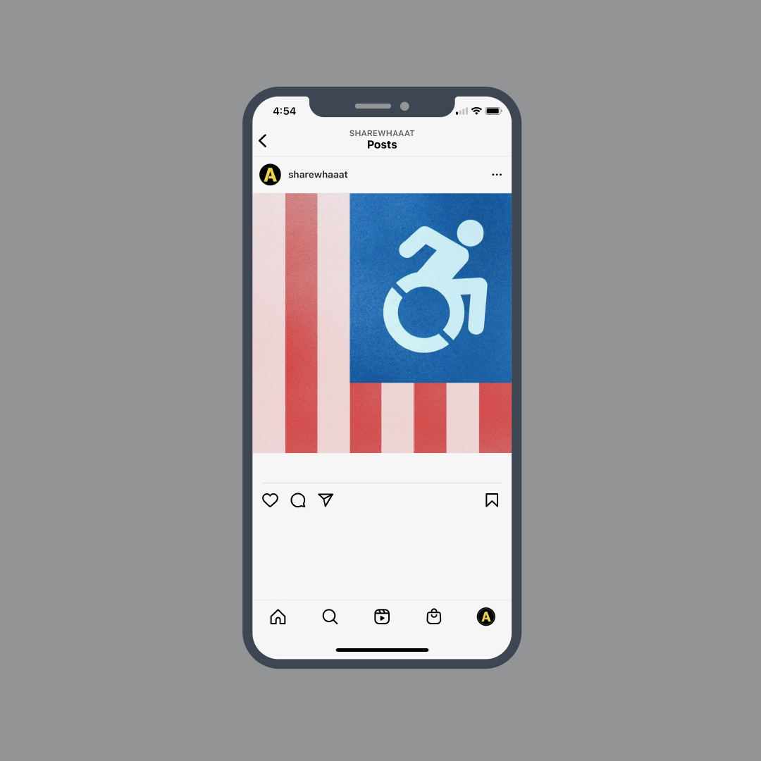
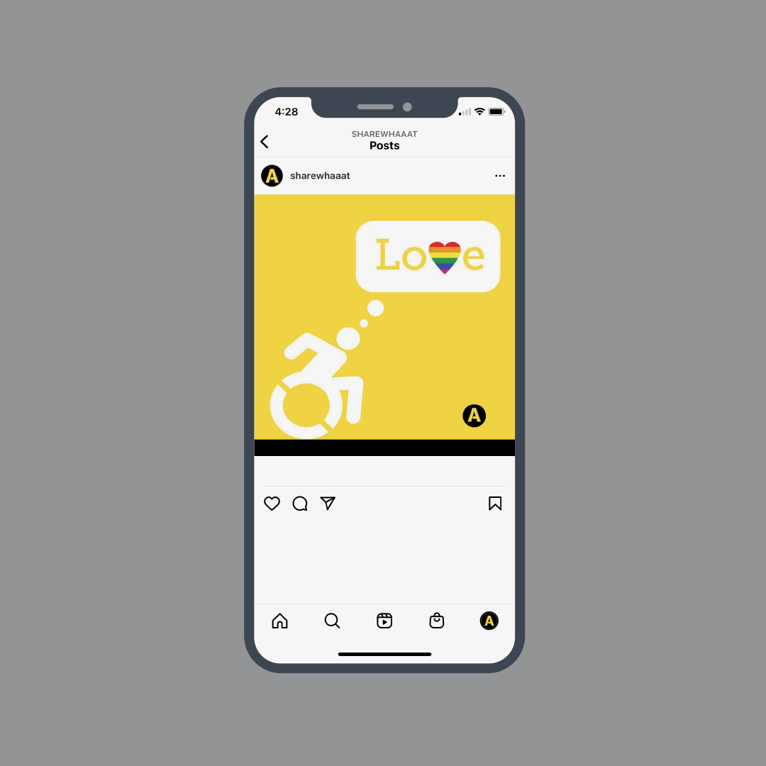
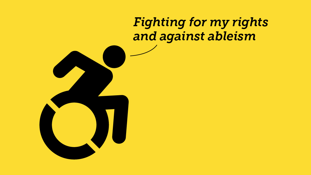
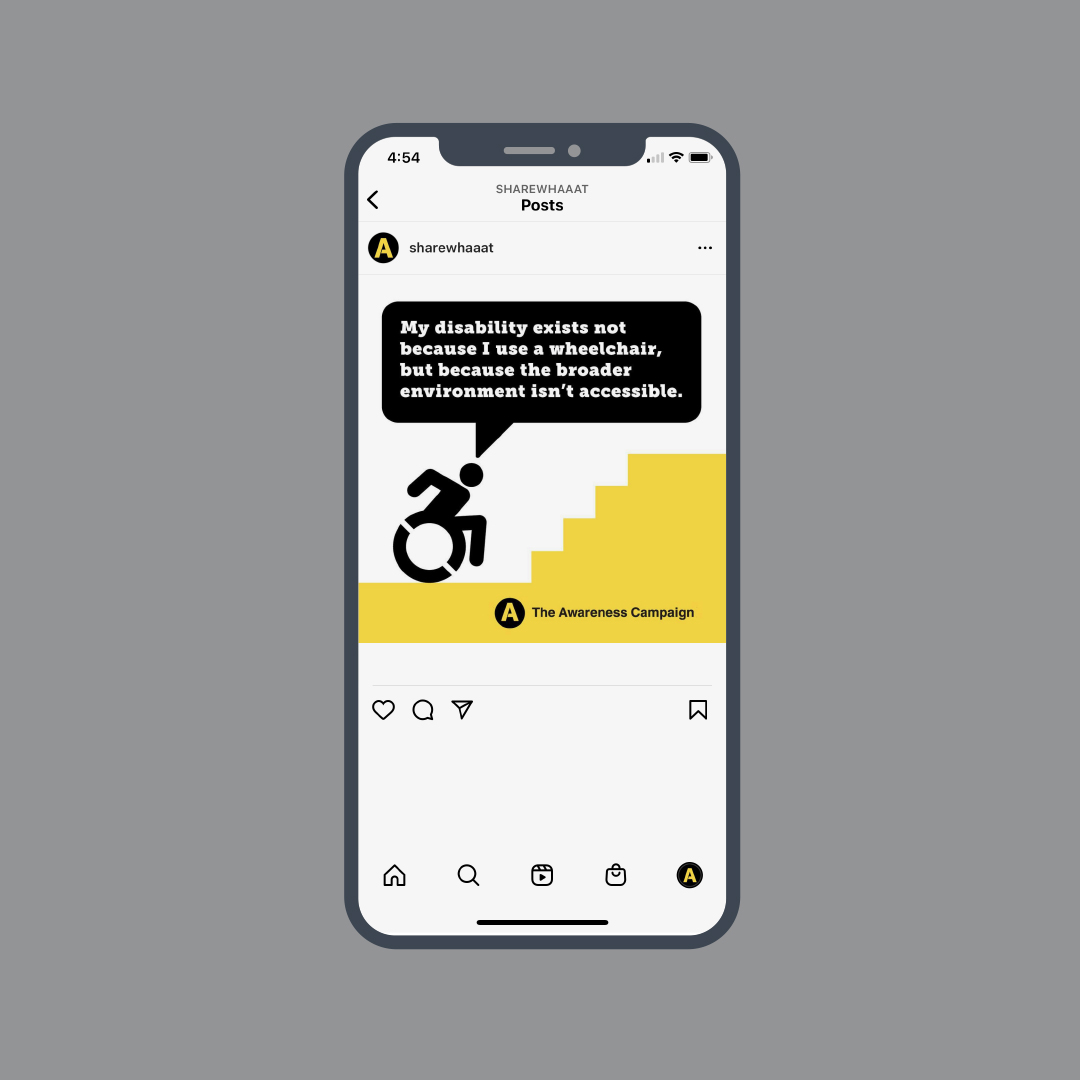
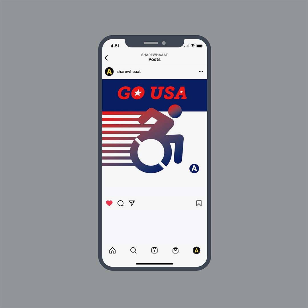
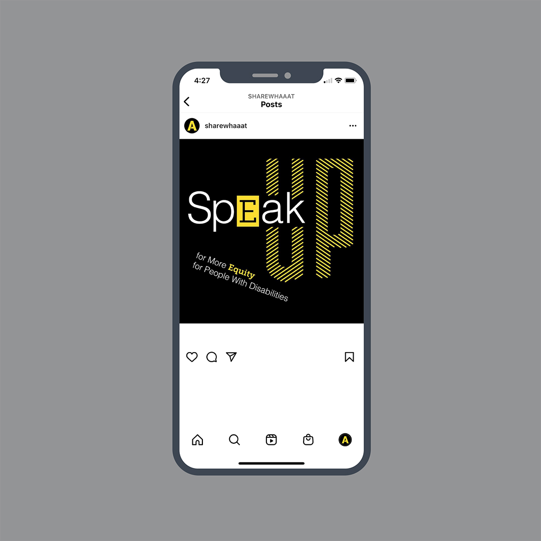
Developing posts on Instagram can be free and enables content creators to reach a large audience. However, grabbing people’s attention to stop scrolling and experience content can be challenging. To meet that challenge, I designed the posts as if I were designing a printed poster. The accessibility icon, designed by Tim Ferguson Sauder, marks accessible locations. I used this icon in several posts for The Awareness Campaign. Using semiotics, The Awareness Campaign flipped the icon’s context by having it be an identifiable symbol of encountering barriers and being inside an ableist environment. This approach was successful because they have a sense of immediacy with their black-and-yellow, bold, geometric shapes. I also employed the ever-evolving social media best practices, such as following the recommendations on how many per week and times of the day to publish content on the Instagram platform.
The Results
Due to the amount of content on the platform, building an audience for the Instagram account was most challenging. However, my work on Instagram led me to develop and propose Emerging Media Design, a new course for the graphic design curriculum. I proposed the course because designing content and managing social media accounts like I was doing soon became a skill that was in high demand. In addition, many of the topics discussed and debated on The Awareness Campaign’s Instagram account became the basis of my research and teaching of accessibility. Developing Instagram content led me to devote myself to my accessibility activities fully.
Lettering by Dave Short
