Producing a Poster for the Faculty Exhibition
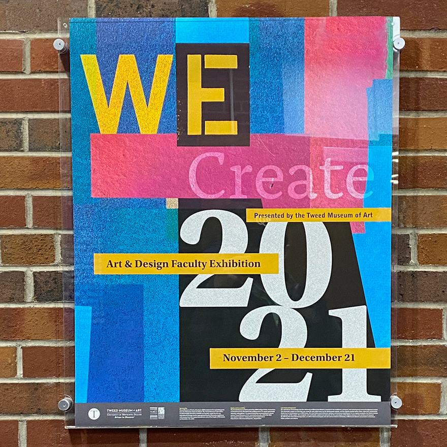
After two long years of COVID-19 delays and interruptions, a faculty exhibition for the Department of Art & Design at the University of Minnesota Duluth (UMD) was finally going to happen. When the exhibition’s poster was being designed, the question became how to represent the exhibition’s theme, We Create, when the faculty works in different disciplines and mediums.
The Backstory
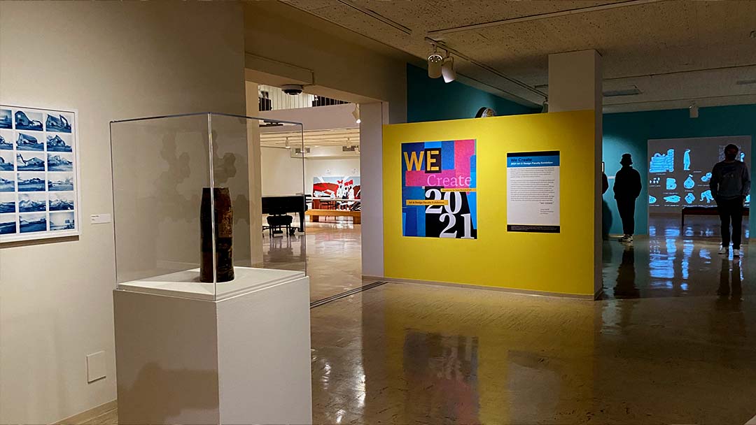
The Art & Design faculty and the rest of the UMD community spent several semesters away from campus due to COVID-19. The 2021 faculty exhibition marked a return to campus and was a sign of normalcy. I volunteered to design the poster that promotes the exhibition, taking on an exciting and challenging duty.
The Approach and Challenge
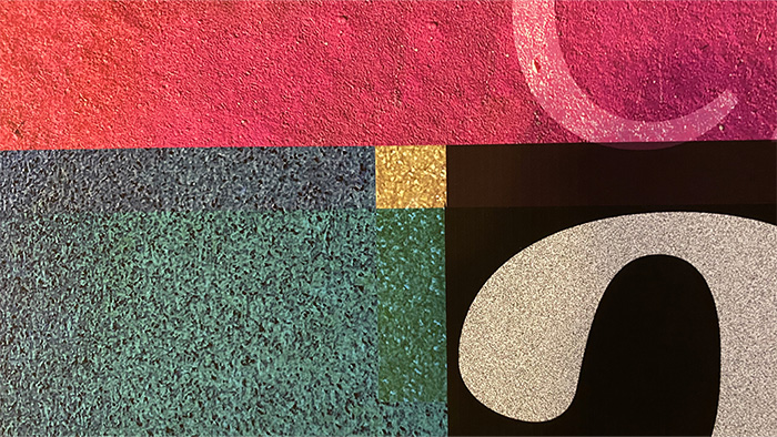
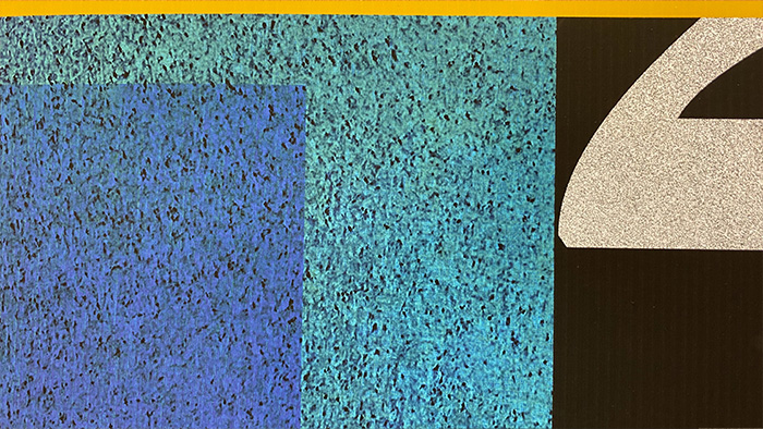
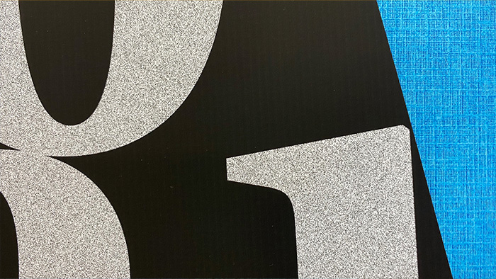
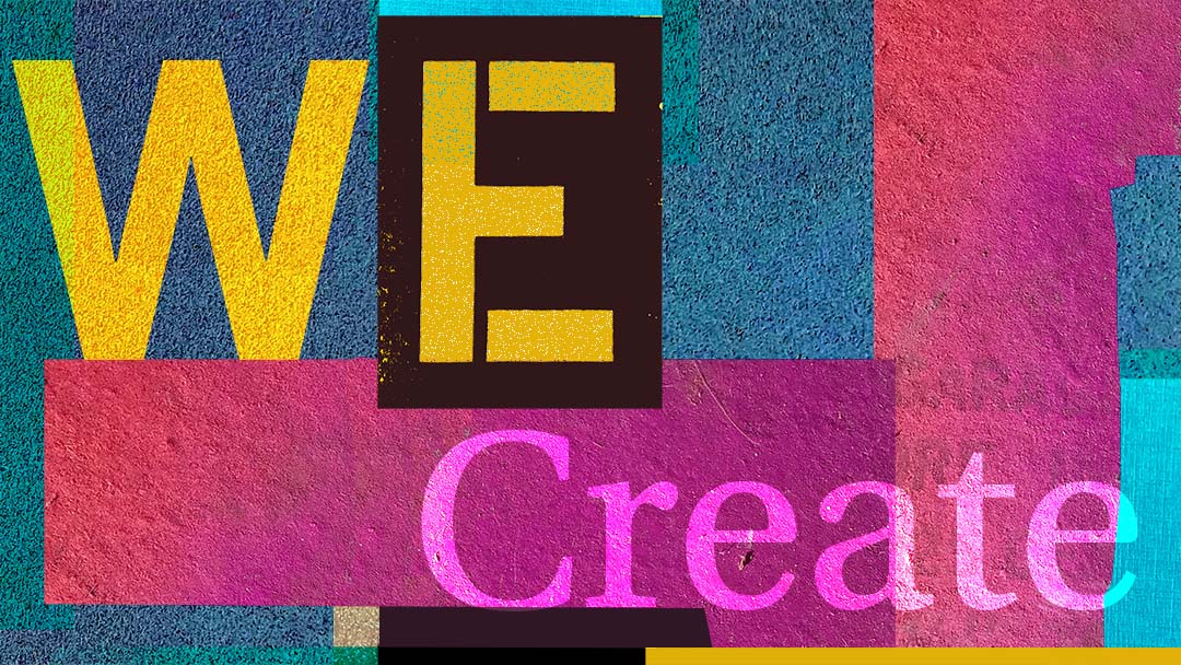
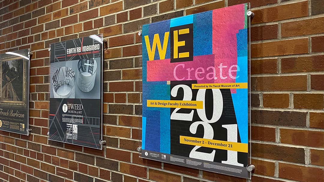
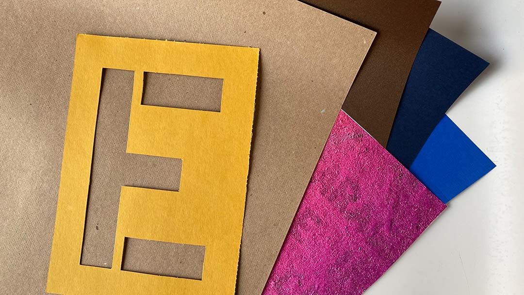
I designed the poster as a digital paper collage to reflect the various mediums working together as one design. This approach responded to the exhibition’s differing mediums and styles that worked together as a collective unit. This strategy also enabled me to experiment with how an abstract collage could translate into an iconic and identifiable image for the exhibition.
My body of photography work has many collage qualities because many of my photographs capture torn paper, rich textures, and color. The way I develop photographic compositions influenced how I used collage elements to develop the poster.
Developing the collage was similar to how I made typographic collages as a student of the late Ben Day, Professor of Graphic Design at Virginia Commonwealth University. Developing the poster in that manner helped me revisit what I learned long ago. This approach still influences my work today.
The Design Process
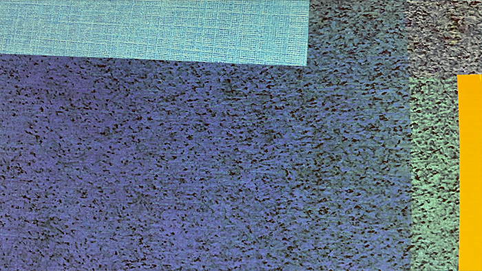
The design process allowed for me to do visual experiments. I scanned various kinds of paper and manipulated them using different layer styles and adjustments in Adobe Photoshop. I kept modifying the layer styles and adjustments until I achieved harmony with the typographic information and other visual elements. Blending different layers resulted in beautiful textures and colors.
Playing With Visual Form
I trimmed the poster into small compositions, which are now part of my experimental work that plays with visual form through collage making and photography.
